|
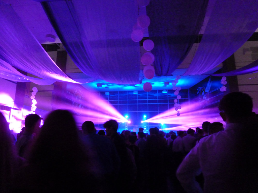
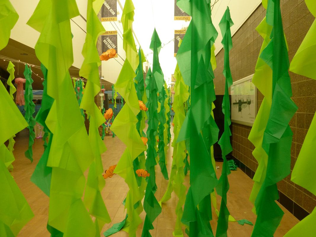
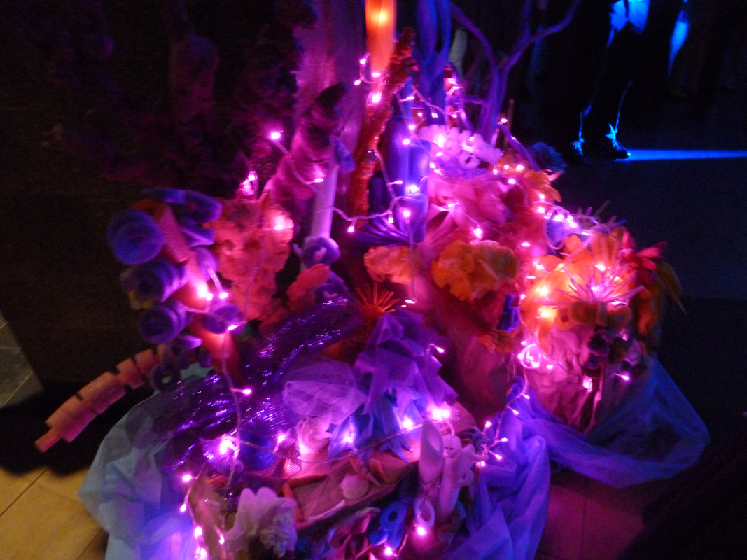
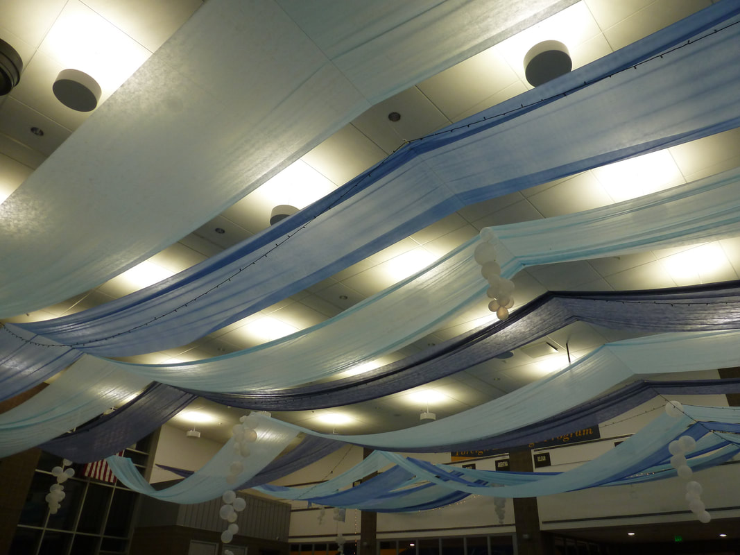
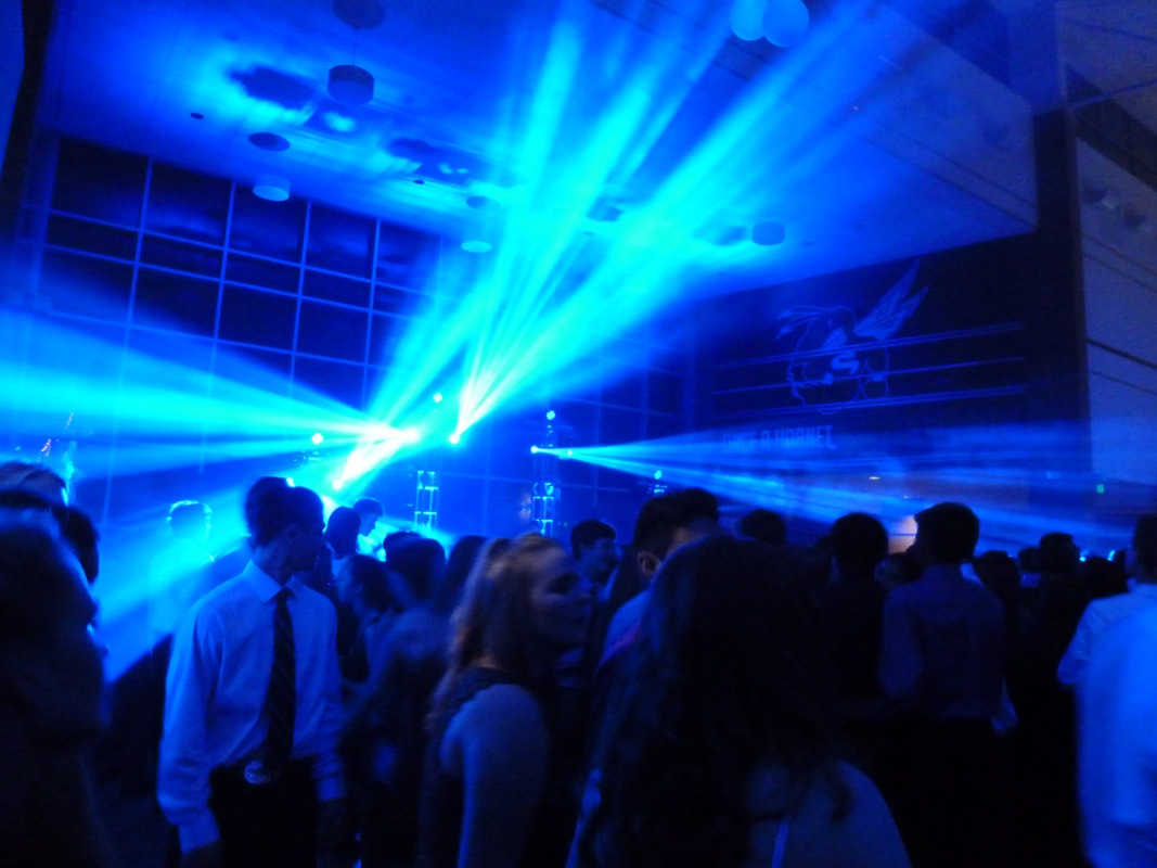
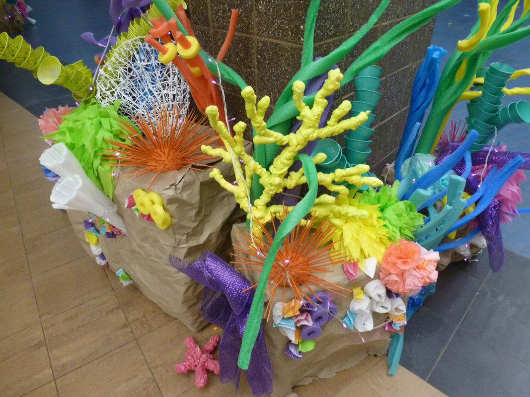
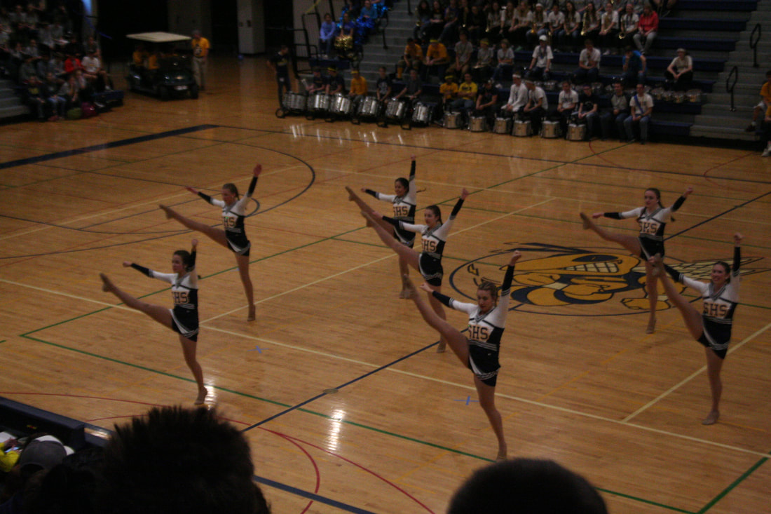
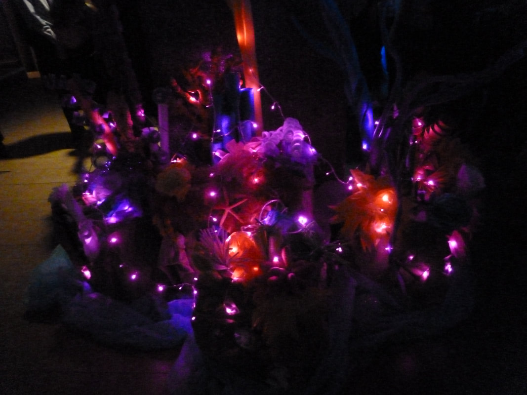
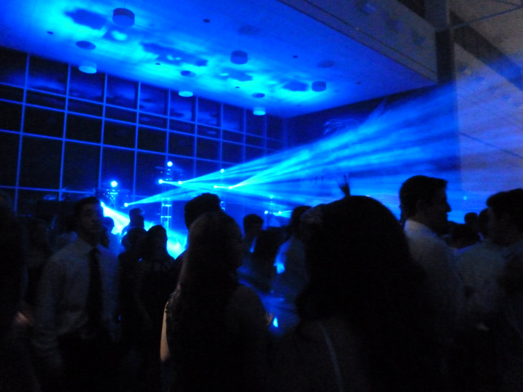
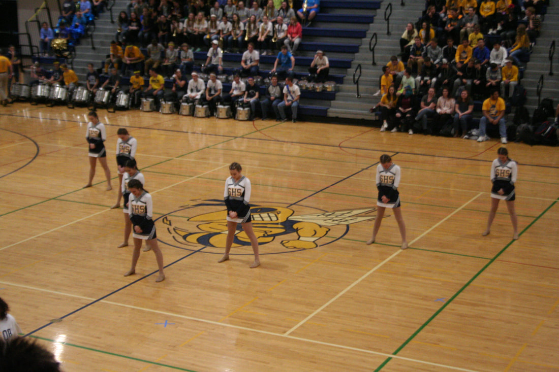
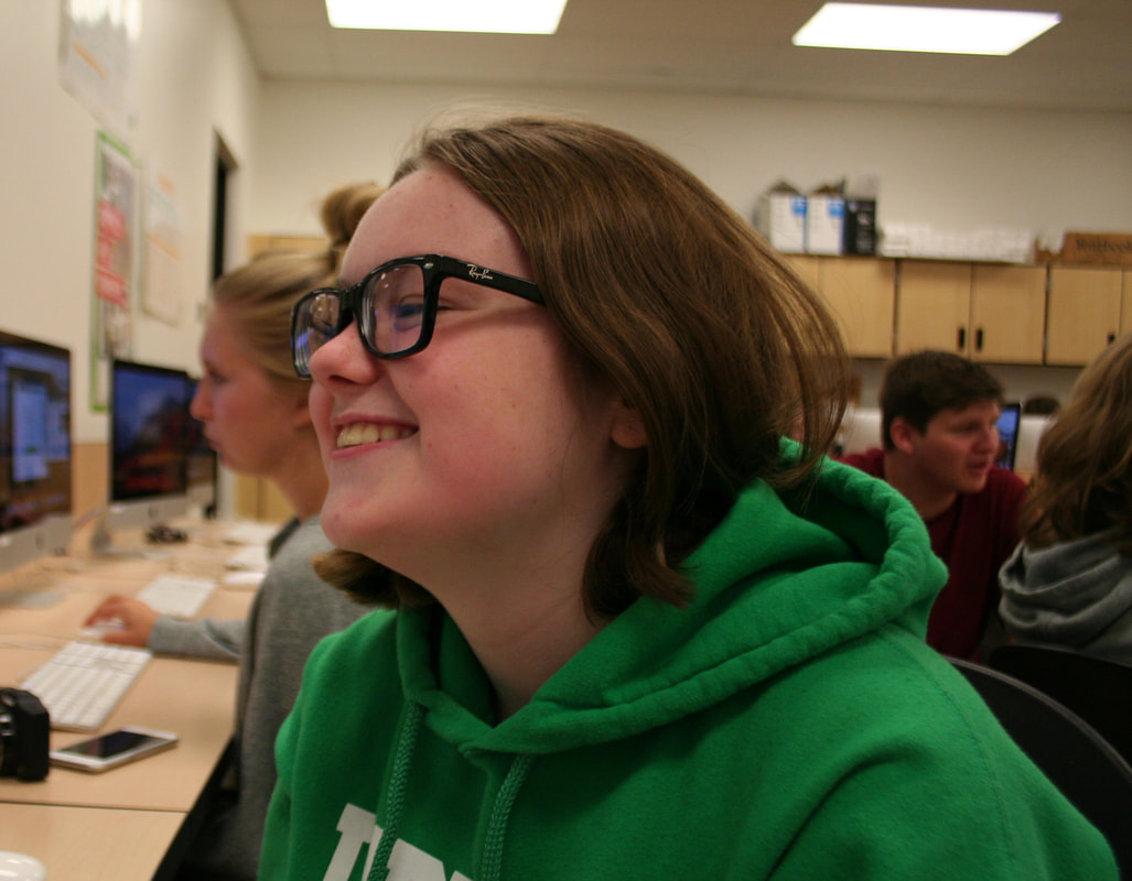
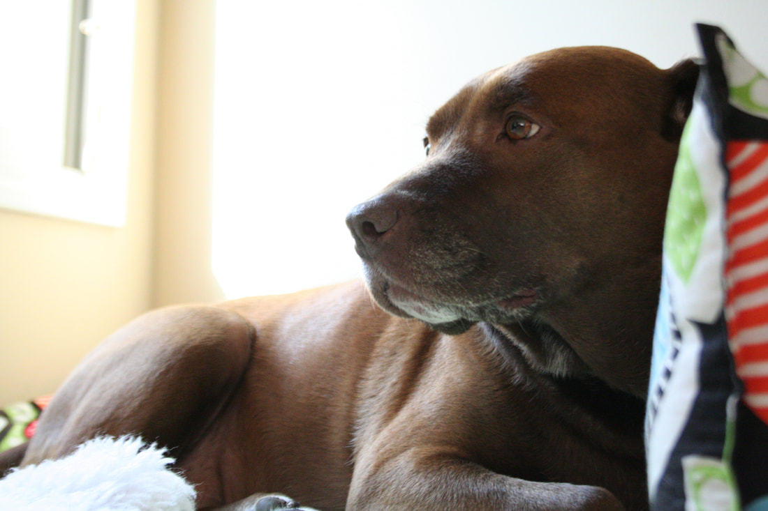
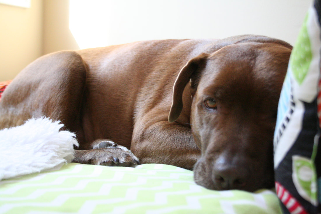
For our third photo assignment, I decided to focus on the subject Event. Because Homecoming was this weekend, I figured it would be a good opportunity to take pictures and capture some of the excitement. I really liked taking pictures at the dance, especially of all the intricate decorations. I think the bright colored lights over the heads of people created a nice effect on my photo. I didn't have as much time to play with the exposure settings because things moved pretty quickly, so as a result some photos are grainy, or out of focus, or darker than I would like. I do have some regrets about this assignment. I originally planned to go take pictures of the parade too but due to schedule conflicts I was unable to. I also forgot my zoom lens at home so the pictures from the pep rally are not as high quality as I would have wanted, and are a bit grainy. If I could do this assignment again I would want to focus more on capturing the detail of a scene and carefully adjusting my exposure to find the best settings.  Shutter Speed: 1/10 sec Aperture: f 3.3 ISO: 800
0 Comments
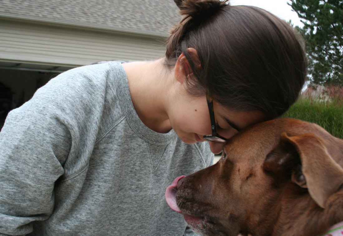
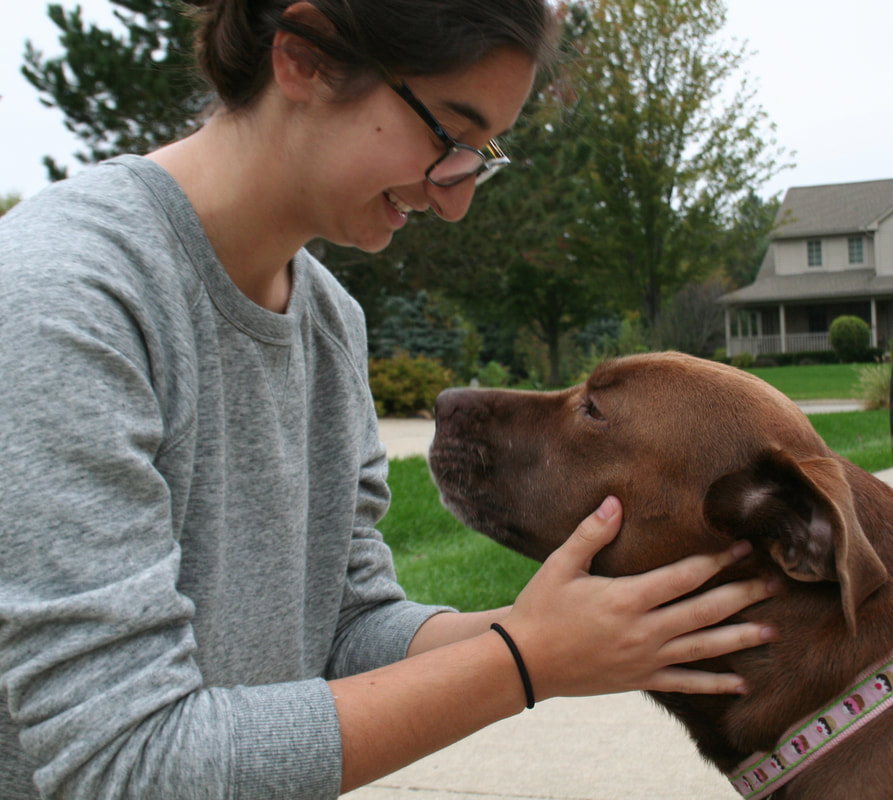
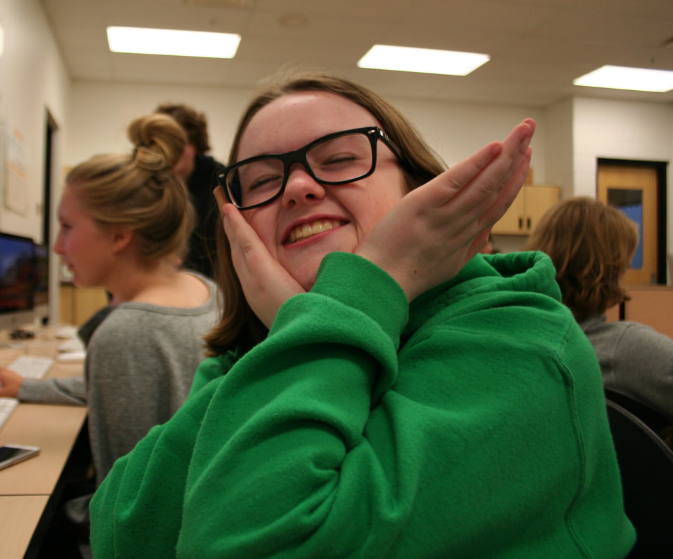
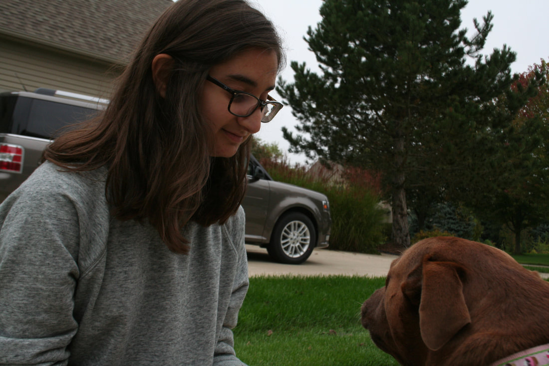
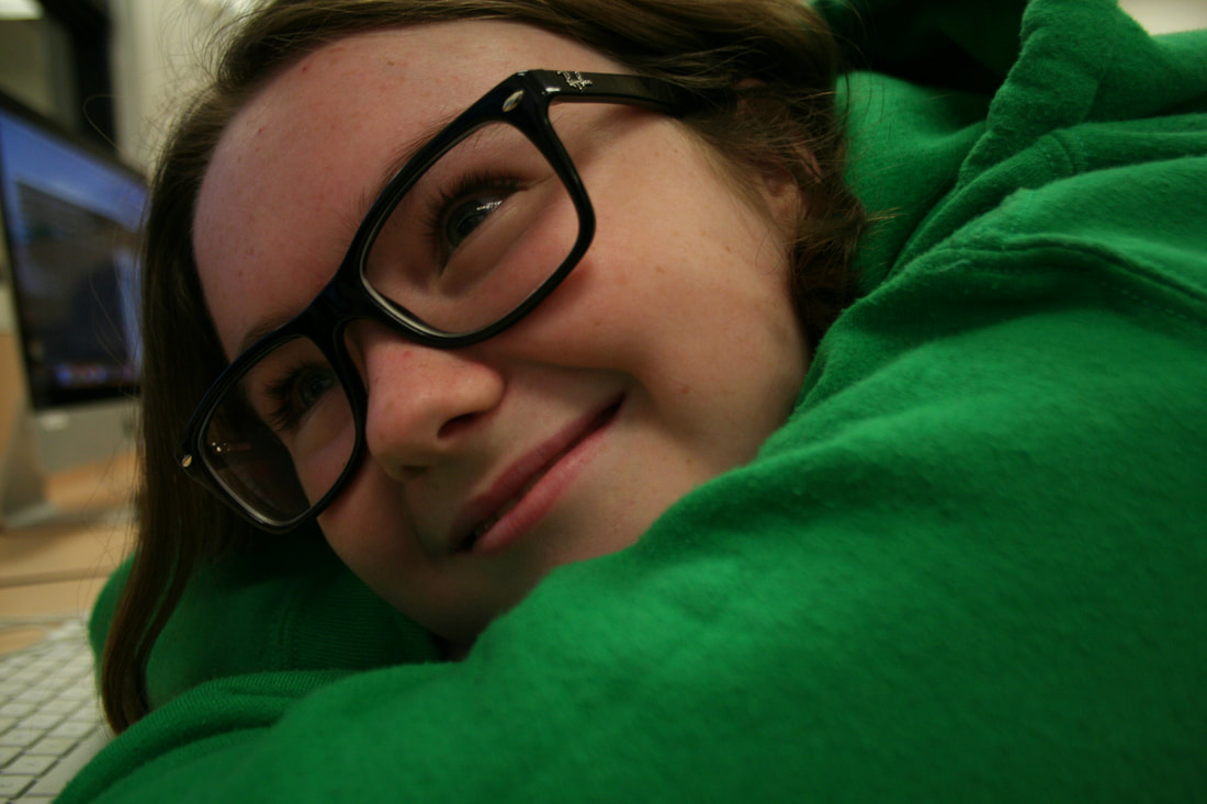
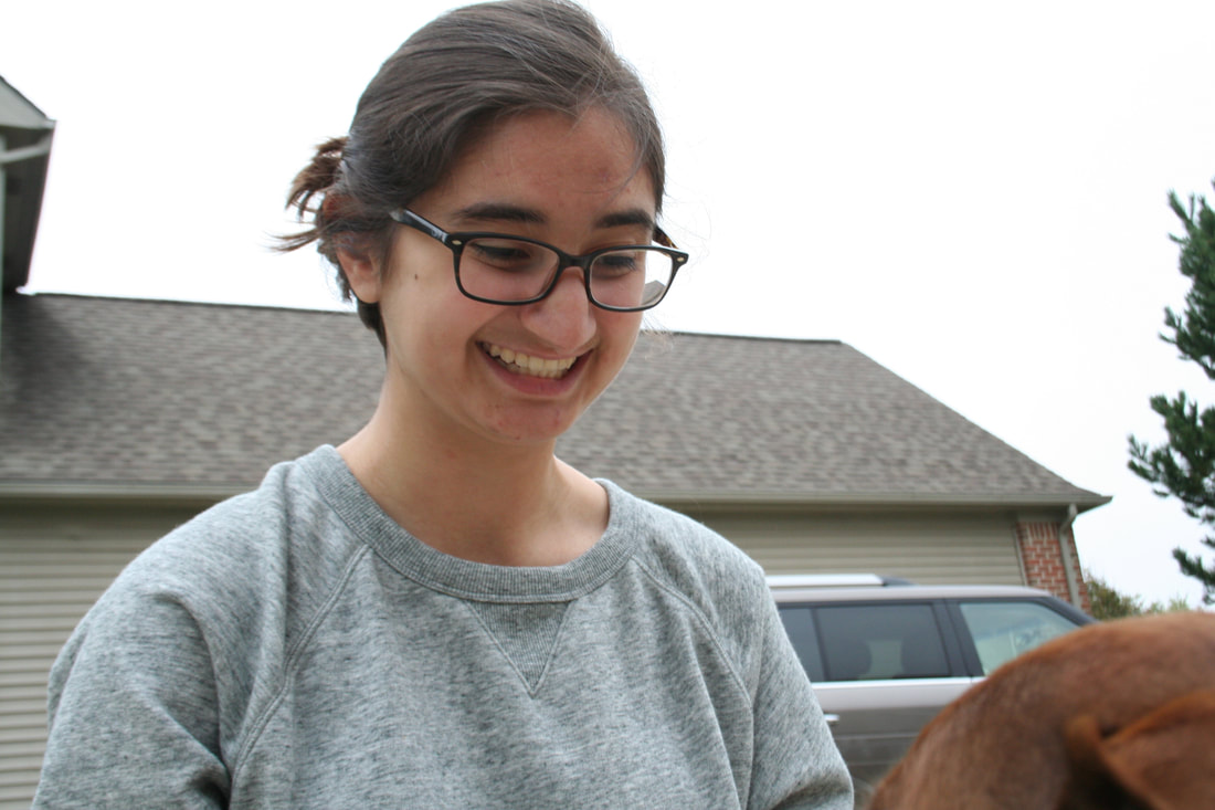
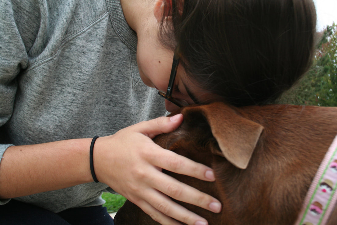
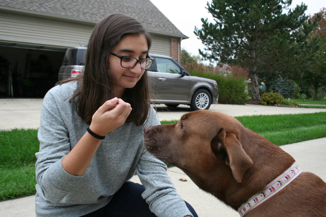
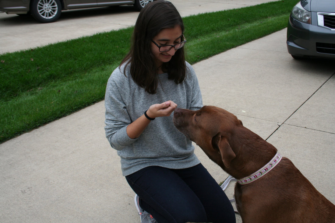
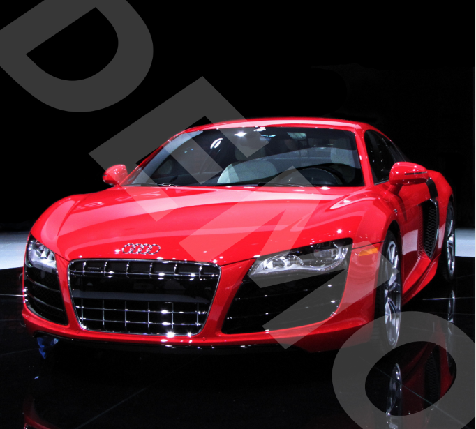
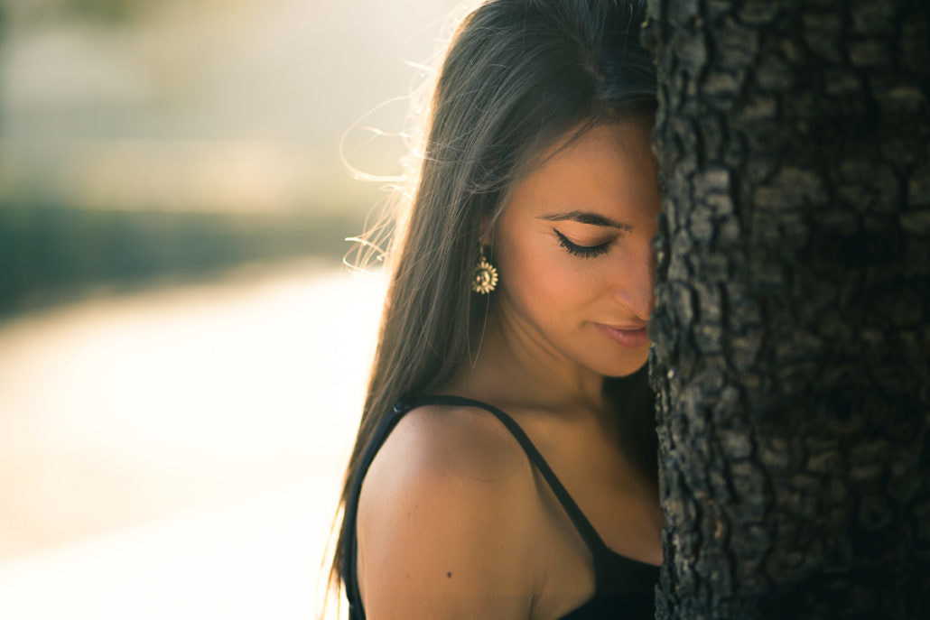
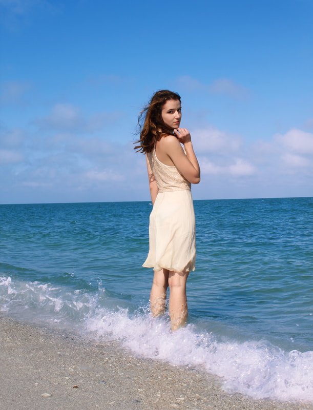
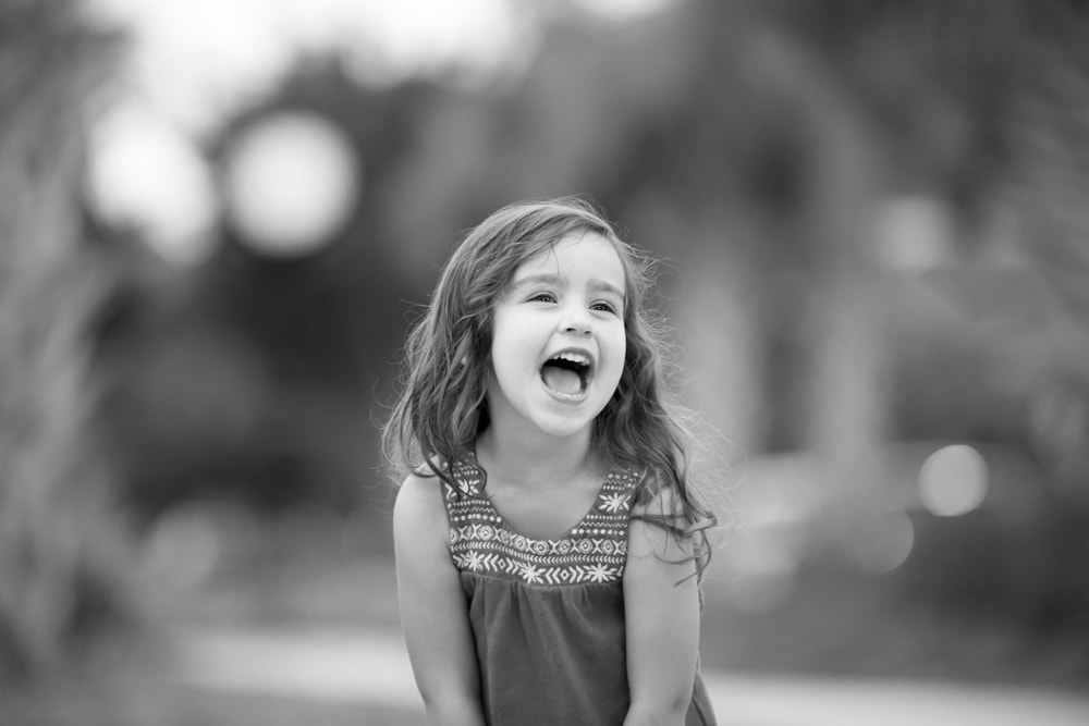
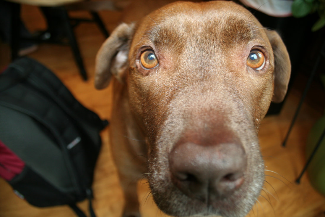
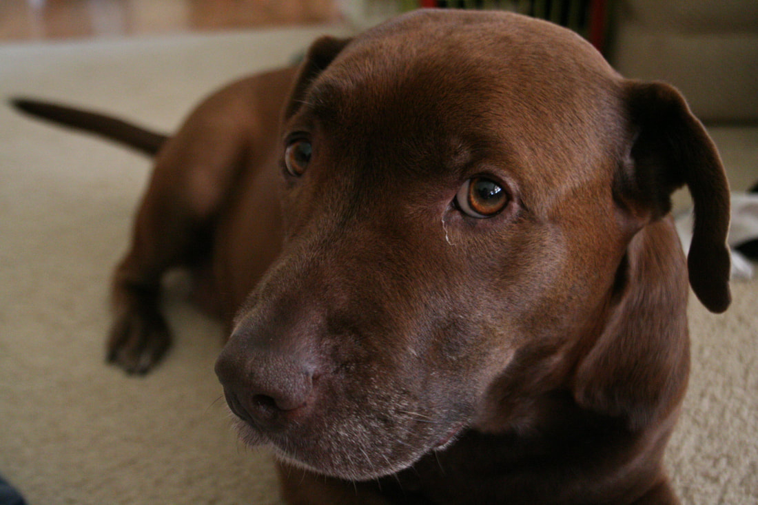
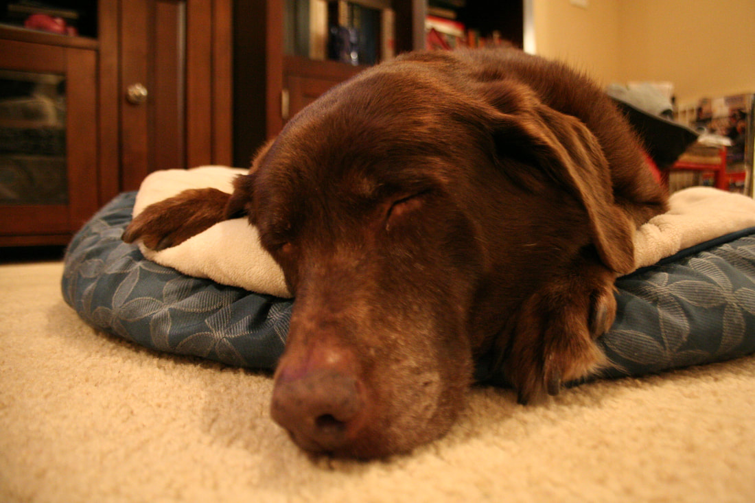
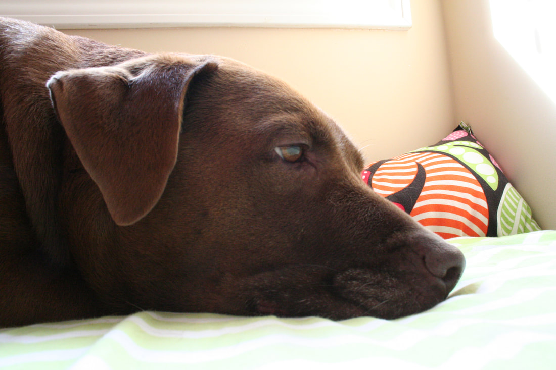
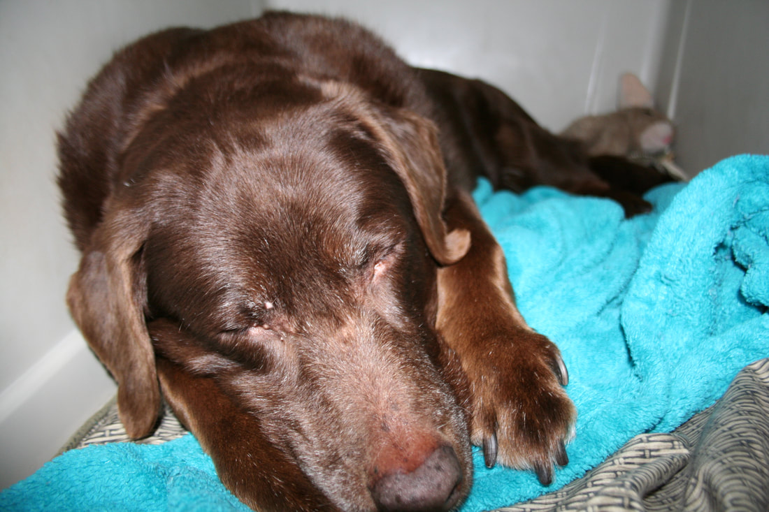
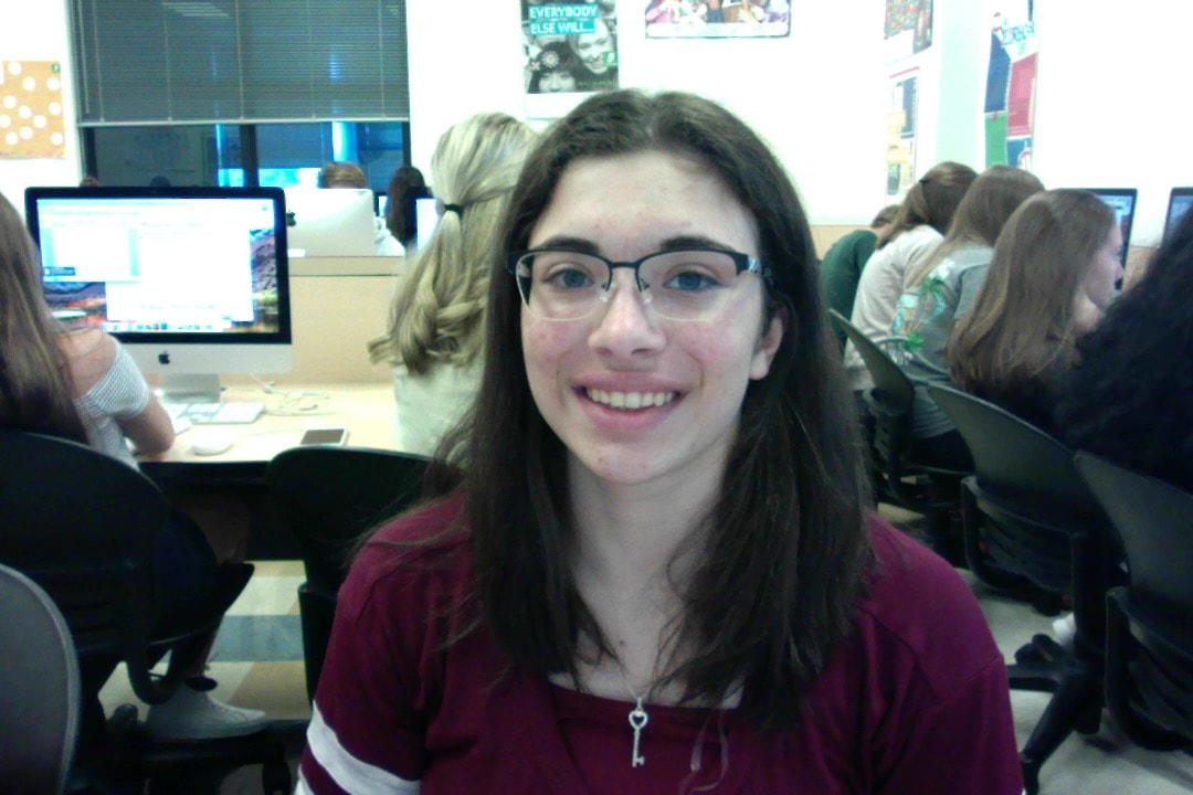
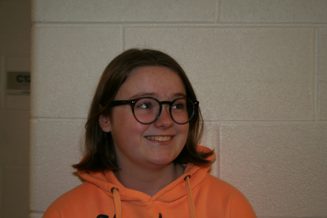
For this assignment our goal was to familiarize ourselves with creating panoramas by stitching photos together in photoshop. We used photomerge for this, which allowed us to simply take pictures and then feed them to the program and let it do the work. When taking photos, we had to manually set the exposure and focus, and keep the camera level to avoid distortion. I had some difficulty with focus, but I think I managed to keep the shot level. For this assignment I took a lot of pictures of murals and hallways. I thought the long murals would come out well in a panorama, because the long frame really showcased all the art and details and made for an interesting piece. I also liked taking panoramas of hallways and corners because of the way it affected the photo's perspective. 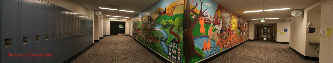 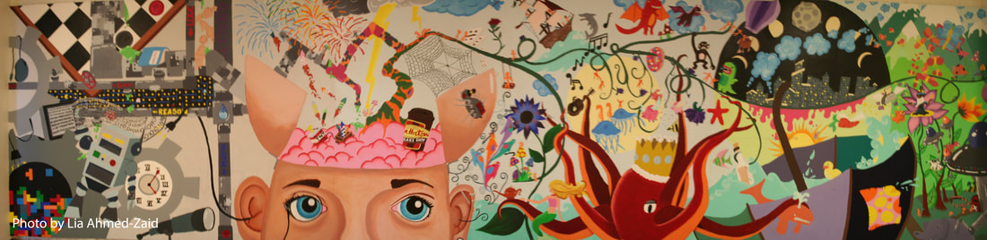 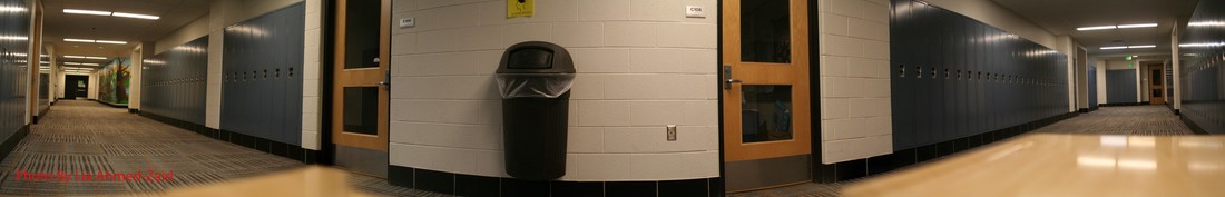 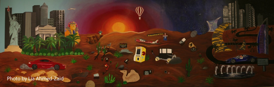 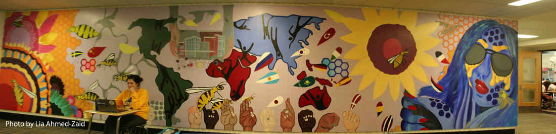 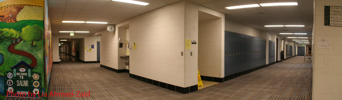 For our second photo assignment, I decided to focus on the subject People. When taking pictures of my friends, I wanted to frame the scene in a way that displays their personality and character. I had some issues with exposure and trying to get the ISO, aperture, and shutter to cooperate, but I think I'm getting used to it by now. If I could do this assignment again I would want to try taking pictures of more people in different poses and places, to have a wider variety to choose from. My subject is Leah Abdallah. Leah is naturally very gentle and kind. Her sweet disposition and strong loyalty to those she cares about reminds me of the unconditional love of man's best friend.  Shutter Speed: 1/125 sec Aperture: f 8.0 ISO: 400 I retouched the photo a bit, using the clone stamp tool to remove part of a car on the right by covering it up with the plants. For our second photoshop assignment, we were supposed to edit a photo of a car to make it look like the target picture. In this assignment I learned how to work with the select tool, the clone stamp tool, the adjustments tab with colors (hue and saturation) and the levels tab. I had some trouble with the clone stamp tool and the select tool, but I eventually got the hang of it. 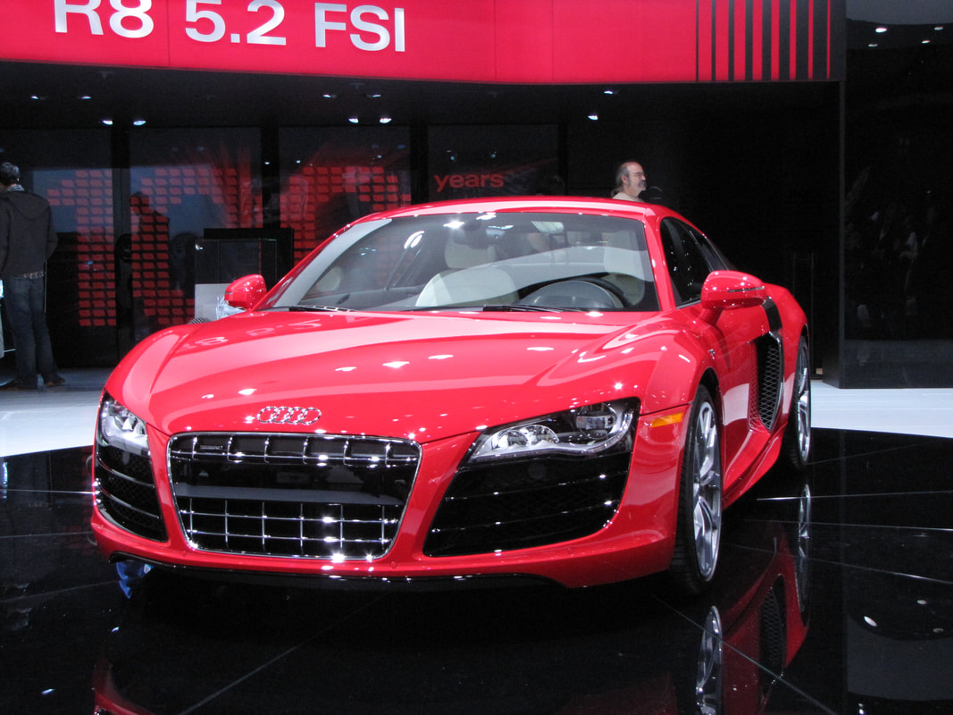 Original 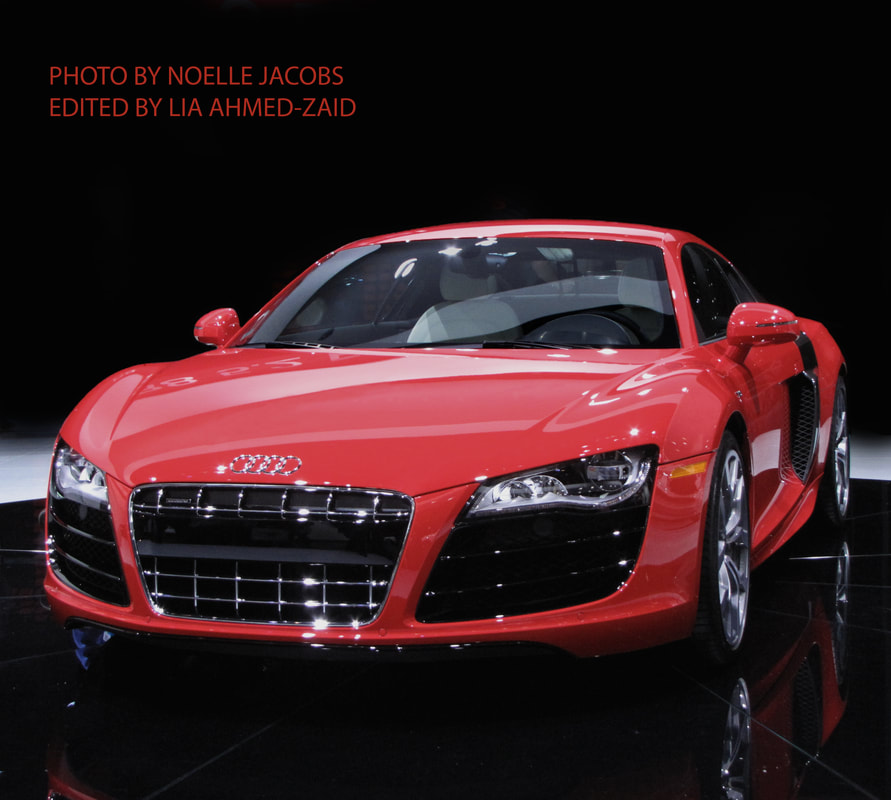 Retouched version Demo photo and extra For our second shooting assignment, I've decided to focus on people. I'd like to display the character and nature of my subject with this assignment, and I'd like to try shooting outside and practicing portrait photography with the aperture and shutter speed settings. Some of the photos that inspired me: By Giuseppe Torre, Jessie's Photography, and MeganPixels For our first photo assignment, I decided to focus on the subject Animals. I wanted to try photographing my pets, but worried that I would have some trouble getting one of them to behave. Luckily, she wasn't feeling as hyper that day so I was able to use her as a subject. I was taking pictures indoors, so I had lots of practice with adjusting the shutter speed, iso, and aperture in order to get a decent exposure. Overall I had a lot of fun with this assignment, but next time I'd like to try photographing a wider variety of subjects.  Shutter Speed: 1/125 sec Aperture: f 4.5 ISO: 1600 I retouched this photo just a bit to remove some gunk by Suzi's eye and spots in her fur. For our first photo editing assignment, we were instructed to use photoshop to create a Warhol-esque popart image. We were to duplicate a portrait and make it four different colors. Original Images 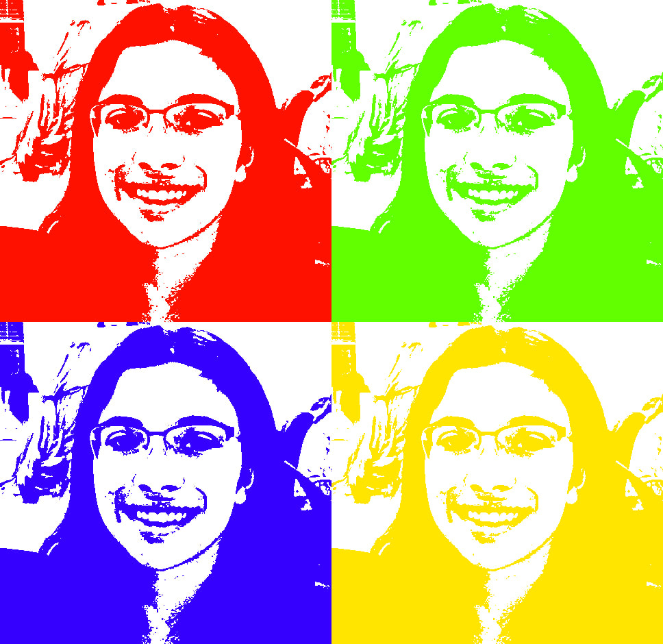 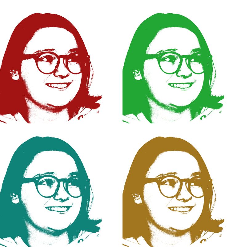 From this assignment I learned the basics of colorizing images, and how to manipulate layers in photoshop. I have worked with GIMP before but photoshop is new to me.
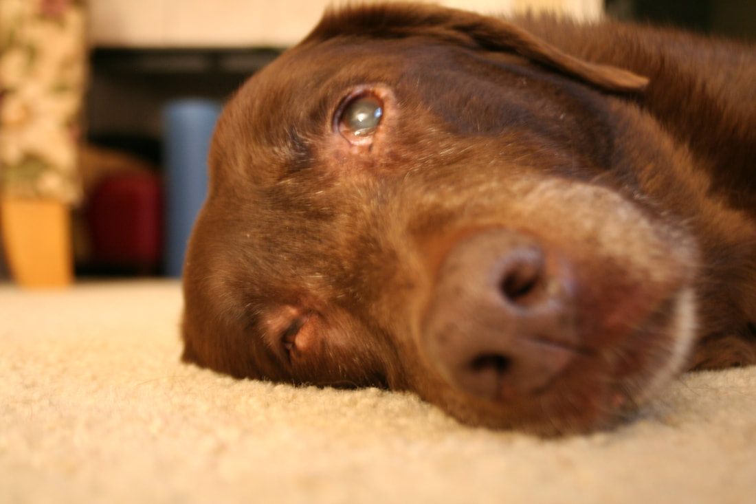
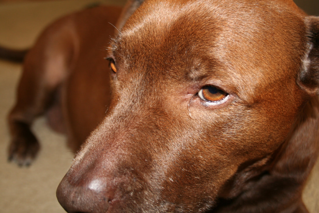
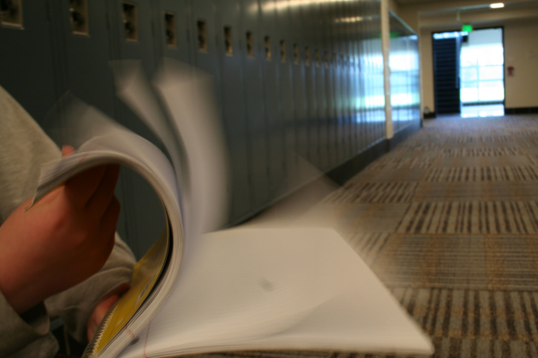
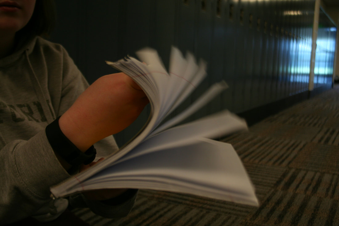
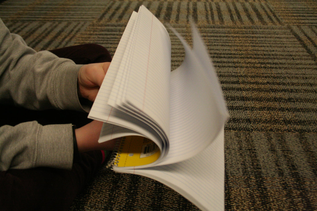
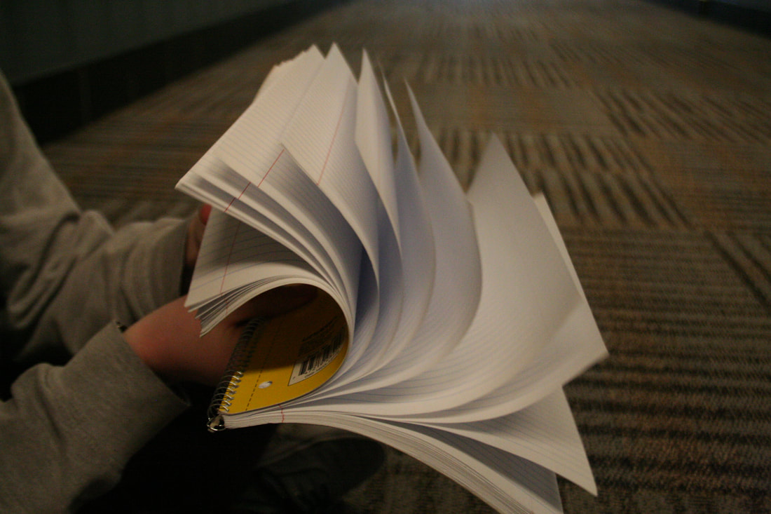
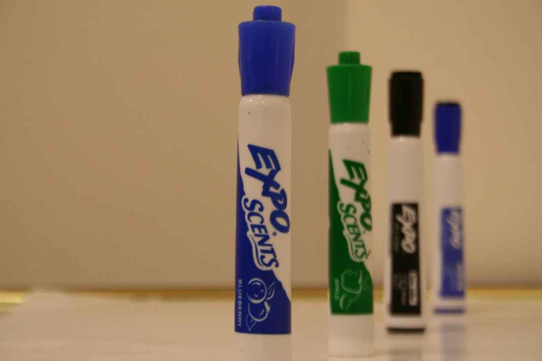
The objective of this assignment was to take two sets of four photos that demonstrated the effect of changing aperture and shutter speed. (Click on the thumbnails to view the image.) In this set I was trying to display how shutter speed affects motion. With the slow shutter speed of 1/8 second, you can barely make out the pages, and the white blur indicates rapid movement. However, increasing the shutter speed allows the camera to get a quicker glimpse of the scene, lessening the motion blur and freezing the action. With a fast shutter speed of 1/250 sec, the camera is able to capture the pages as they are moving, and freezes them in place. They appear to be suspended in air and you can make out the detail on the pages. In this set I attempted to display how changing the aperture (the size of the lens opening) impacts the depth of field. With a large opening of f 5.6, the camera lets more light in, and creates a smaller depth of field. This shows a sense of depth, and you can tell the markers are different distances from the camera. The first marker is in focus and details can be made out easily, but the markers behind are blurred and out of focus. As you decrease the aperture, the depth of field becomes larger and more of the background is in focus. With an aperture of f 25, you can make out the details on all the markers, and it's harder to tell that they're not on the same plane. Fast shutter speed: Freezes movement, takes a quick snapshot of the scene. Slow shutter speed: Emphasizes movement, creates motion blur. Large aperture: More light comes in, small depth of field, blurs background and focuses on subject. Small aperture: Less light is let in, larger depth of field, more of image/background in focus. The subject I have decided on for our first photo assignment is animals. (Changed my mind from motion) I think it would be fun to try photographing animals, but it might be tricky to get them to cooperate. In my photo I would like to display the personality and companionship of a pet, and I think to achieve that I want to take a picture of one of my dogs while they're lying down, as opposed to trying to get a picture while they're riled up. I think working on capturing a scene indoors will also help my understanding of manipulating light through shutter speed, aperture, and ISO. I took a look at some photos online for some inspiration, and I really liked these three:  By Champ&Candice  By Tanto Yensen  By Traer Scott Our first assignment was to take 11 pictures, displaying each of the 11 given elements of composition: Rule of thirds, symmetry, pattern, lines, texture, depth of field, perspective, framing, space, balance, and color. It was also an experience to help familiarize us with using the camera and uploading pictures, as well as creating our blogs. Over the course of this assignment I learned how to work with the camera and upload pictures through a camera. I also learned about the elements of composition and it was really fun to walk around the school purposefully looking for the elements. 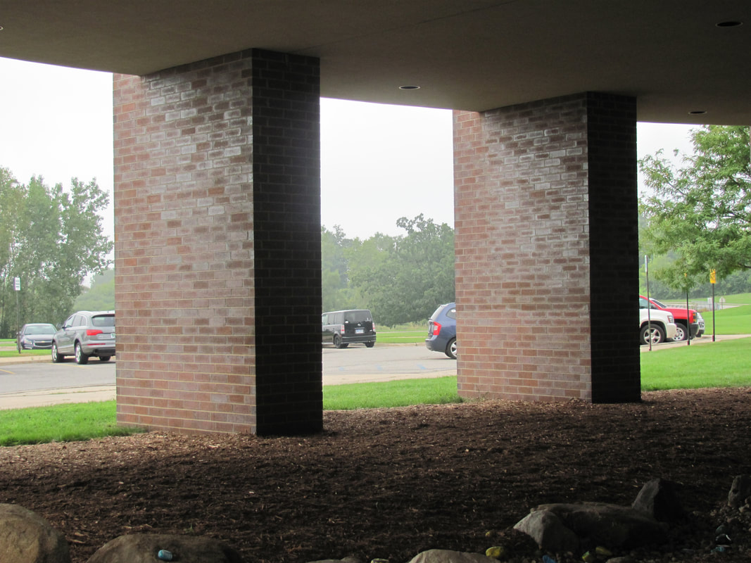 RULE OF THIRDS: I positioned the camera so that the two pillars were in line with the 1/3rd lines of the grid. 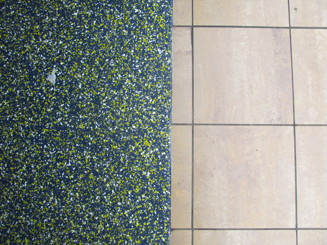 SYMMETRY: I tried to create asymmetry here through the juxtaposition of the colorful paint-splattered floor next to the neat tiles. 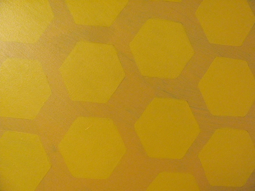 PATTERN: A pattern of hexagons. 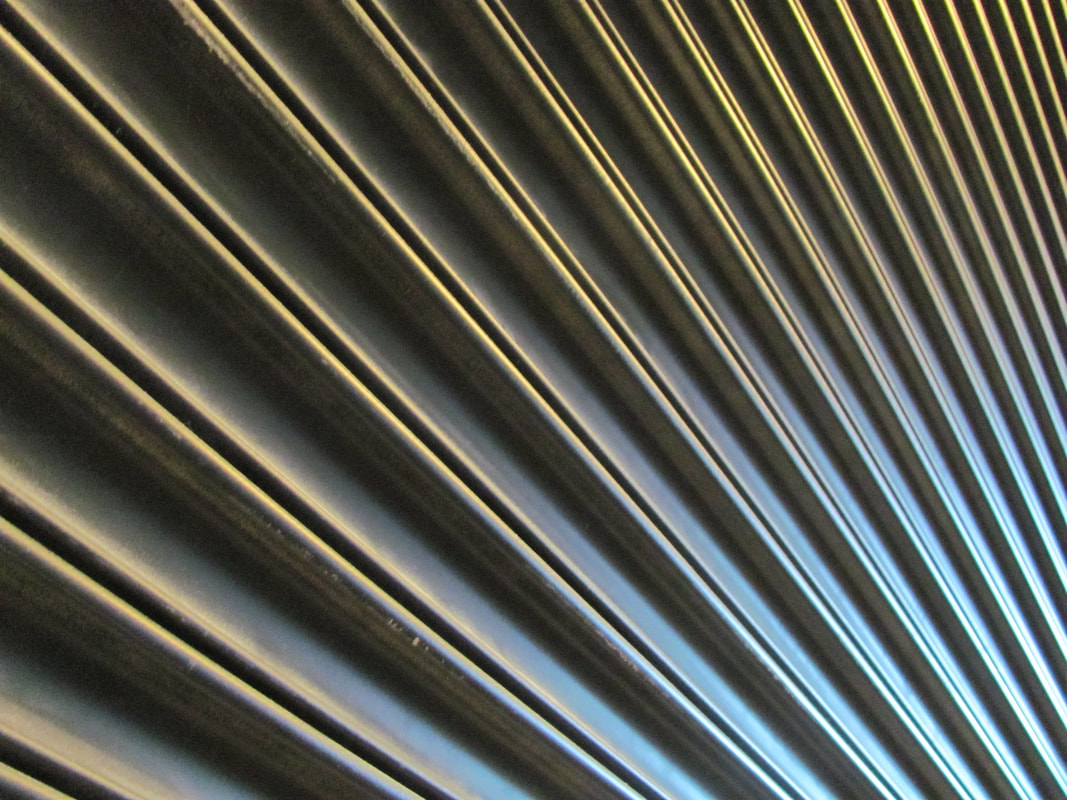 LINES: Diagonal lines of a grate. 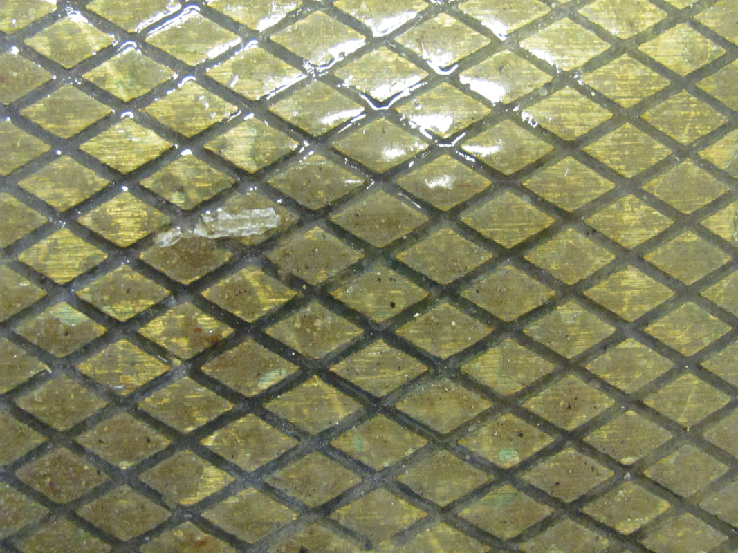 TEXTURE: I tried to get the light to reflect off the diamonds in order to capture an interesting texture. 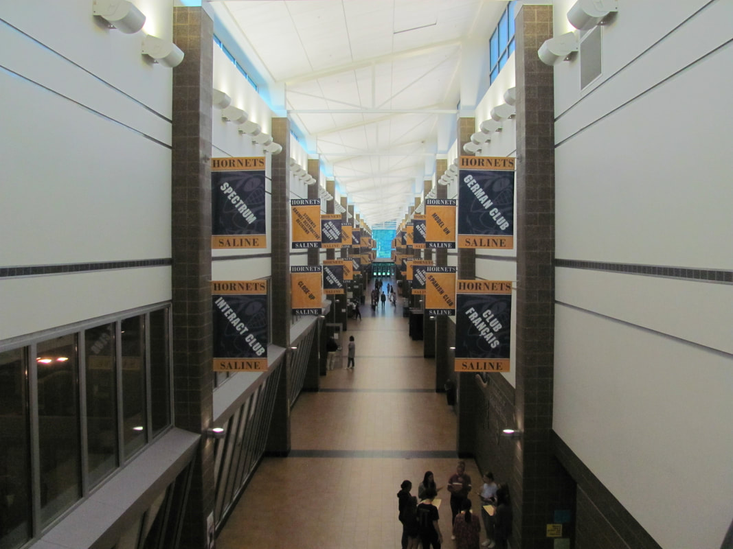 DEPTH OF FIELD: I used a wide angle shot to capture the depth of the hallway. 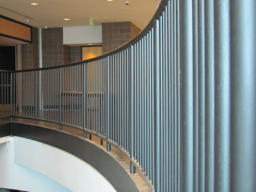 PERSPECTIVE: I liked the way the rail looked when I moved the camera close to it. The way the lines are aligned draws the viewer's eye from right to left and creates a unique perspective. 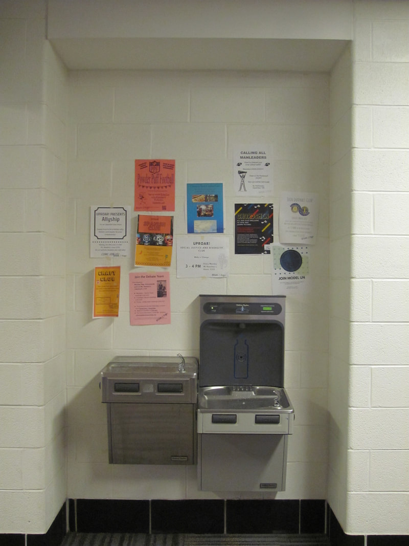 FRAMING: The walls surrounding the alcove create a boundary around the posters and fountain. 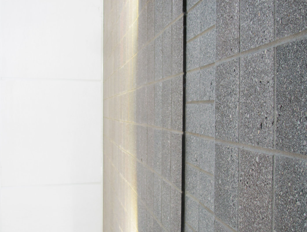 SPACE: The white ceiling to the left of the wall creates the feeling of unused space by the wall, and draws the eye from left to right. 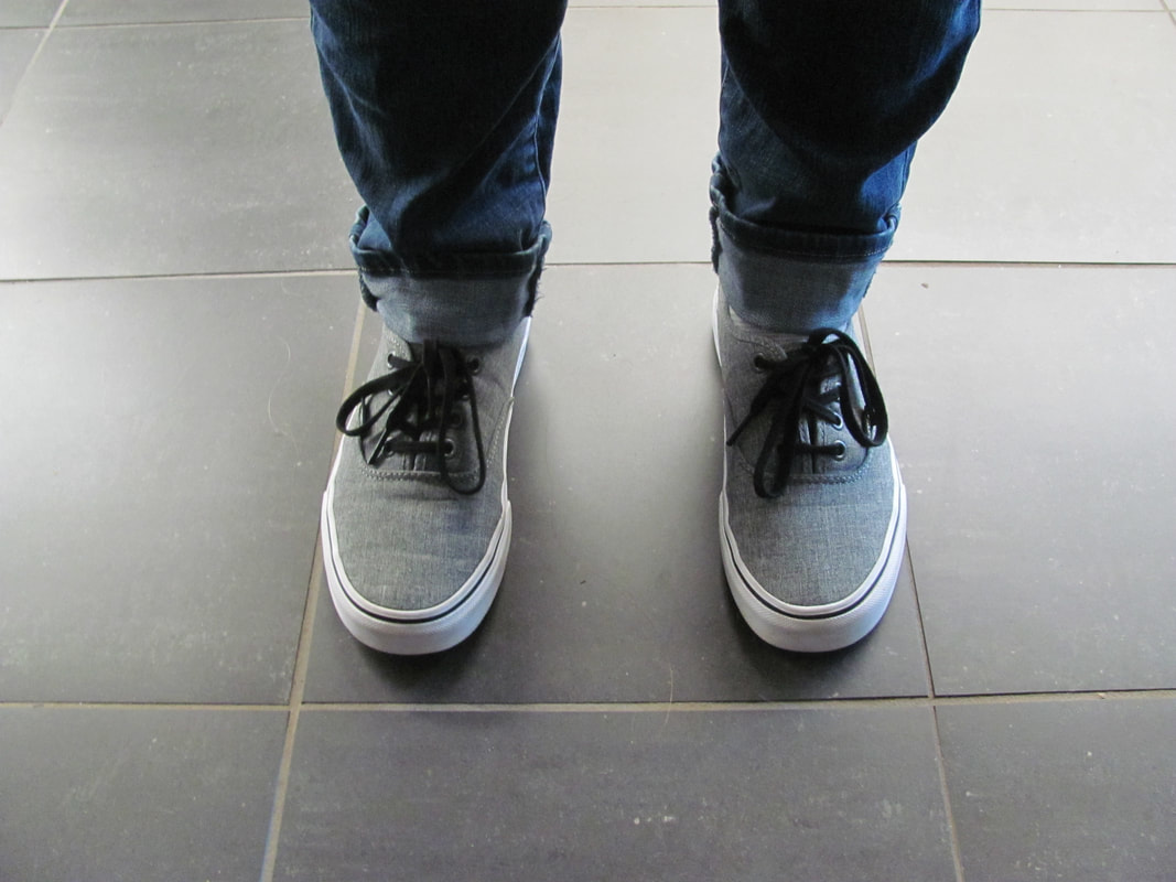 BALANCE: There is a shoe on each side of the image, creating harmony between both elements. 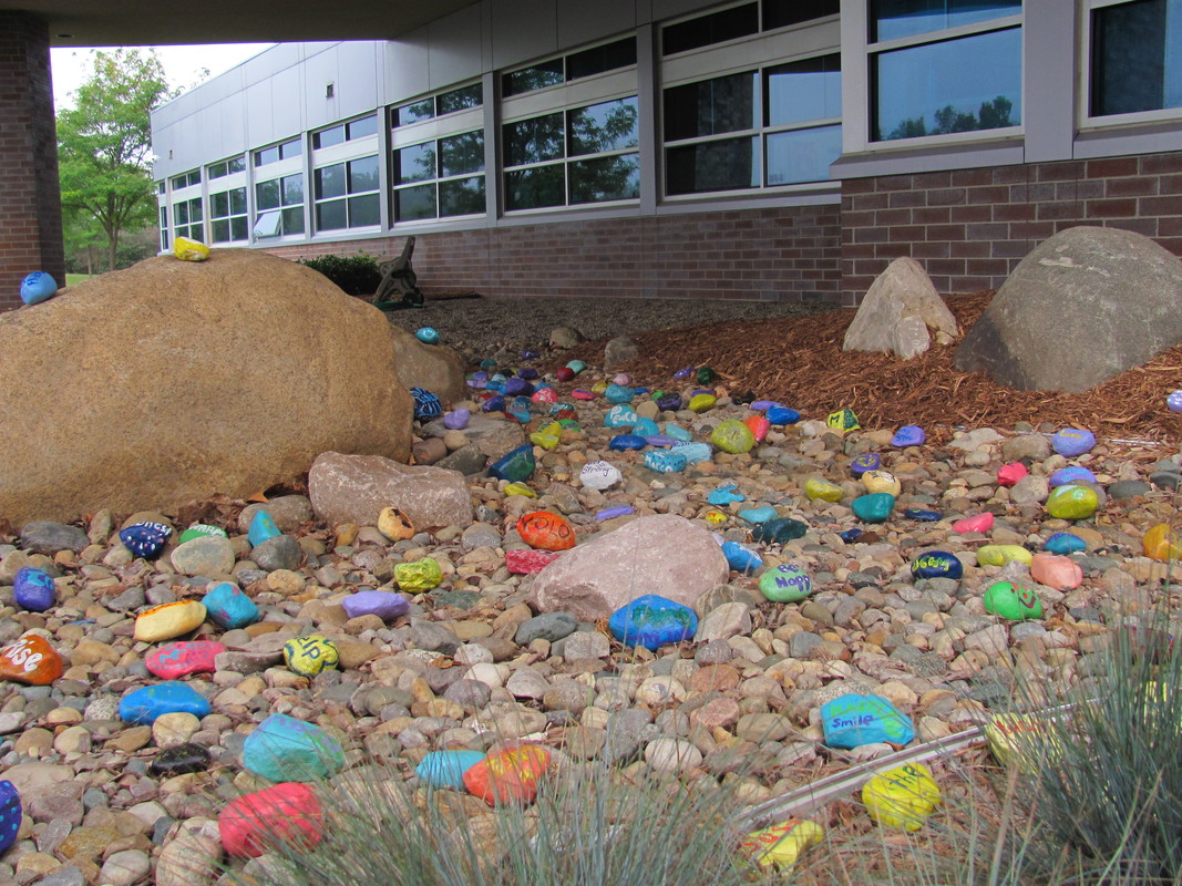 COLOR: I liked all the different colors of the painted rocks compared to the dull gray of the others.
|